What Makes Frame Color Important?
When decorating a room, many people focus heavily on the art itself while overlooking the critical importance of the frame color, which serves as the bridge between the artwork and your room's design. A well-chosen frame adds contrast, harmony, or even a bit of drama to your space. Conversely, a poorly selected frame can clash with other elements in the room or hinder the visual impact of the artwork.
Frames are part of your room’s "visual narrative." For instance, a sleek black frame may give a modern, minimalist feel, while a warm wooden tone could evoke a rustic, cozy vibe. The frame color can either amplify the impact of your art or drown it out, depending on how well it complements its surroundings.
Understanding the Basics of Color Schemes
Before diving into specific frame colors, it's essential to understand the basics of color schemes. A color scheme refers to the combination of colors used in a design to create a mood or aesthetic. There are various types of color schemes:
-
Monochromatic: Uses varying shades of the same color for a harmonious and relaxing appeal.
-
Analogous: Uses colors that sit adjacent on the color wheel, like blue and green, for a naturally cohesive and balanced look.
-
Complementary: Combines colors from opposite sides of the color wheel, like blue and orange, for high contrast and drama.
- Neutral: Leverages blacks, whites, grays, and beiges for timeless and versatile decor.
Understanding your room’s color scheme is essential when choosing frame colors, as this will help ensure that your frames either contrast appropriately or blend seamlessly with their surroundings. By matching or thoughtfully contrasting the frame color with the broader elements of your decor, you can enhance both your chosen artwork and the space itself.
How to Choose Frame Colors Based on Your Decor
Every room has its own style, mood, and essence, and the color of your frame should reflect that. Here's how popular frame colors can work with different styles of decor:
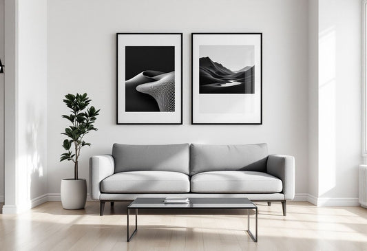
Black Frames
Black frames are some of the most universally loved options when it comes to wall decor. They are minimalist, bold, and give off a contemporary feel. You’ll often see black frames in modern or industrial-style homes.
- Best suited for: Clean, modern interiors with crisp lines and neutral or monochromatic color schemes.
- What they do: Black frames create a stark contrast that makes your art stand out, especially if the artwork itself has light or bright colors.
White Frames
White frames evoke a sense of lightness and simplicity. White frames are perfect for Scandi-inspired decor or spaces with neutral or light color schemes.
- Best suited for: Minimalist, Scandinavian, or beachy spaces with light-colored walls.
- What they do: White frames melt seamlessly into white walls, allowing the artwork to take center stage. They add a sense of calm and airiness.
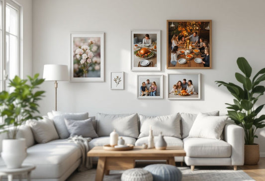
Wooden Frames
Wooden frames come in a variety of shades — from light oak to dark mahogany — and bring warmth and texture into a room. Depending on the type of wood, they can be either modern or traditional.
- Best suited for: Rustic, farmhouse, or nature-inspired interiors, and also in industrial lofts when paired with exposed brick or metal elements.
- What they do: Wooden frames give the artwork and the room a styled yet organic look, tying natural materials into the decor.
Metallic Frames
Metallic frames, like gold, silver, or bronze, lend a touch of luxury and elegance. Often found in traditional or high-end designs, metallic frames add glamor without being overbearing.
- Best suited for: Art Deco, vintage, or luxurious interiors where the goal is to create an opulent and elegant atmosphere.
- What they do: Metallic frames catch the light and reflect a glowing sheen, drawing attention to the art and highlighting its importance.
How to Match Frame Color to Your Wall Color
Choosing the right frame color often comes down to how well the frame complements or contrasts with your wall. Here are some guidelines:
-
For white walls: Black, white, or metallic frames work exceptionally well by adding contrast or subtle elegance without clashing. White frames offer a minimalist look, while black frames make a statement by providing a stark contrast. For something a little more polished, metallic frames can add an understated touch of luxury.
-
For dark-colored walls: White frames pop against dark paints, offering a striking contrast. Wooden or metallic frames also work well here, as they bring warmth and sophistication without overwhelming the space. For instance, a light oak wooden frame can soften the intensity of a deep-colored wall, or a gold metallic frame can elevate the room’s aesthetic by adding a luxurious feel.
-
For brightly colored walls: In rooms with bold, lively colors on the walls, neutral frames (black, white, or wood) are generally your safest bet. These neutral options balance out the vibrancy of the walls while still emphasizing the artwork. If you’re looking for something more daring, opt for a frame that features a complementary color. Just ensure that the shades strike a careful balance so they don't compete with each other.
Selecting frame colors with the backdrop of your wall color in mind helps create focus, balance, and harmony throughout the room. If you're unsure, try experimenting with different frames to find the one that works best with your artwork and decor style.
Adding Contrast with Frame Color
Sometimes, the goal is to make both the frame and the artwork stand out. This is where contrast comes into play. High contrast between the frame and the artwork can create a more dynamic appearance. For example, using a white frame to surround a dark painting makes the piece more intense. Similarly, a black frame on white walls can create a strong statement without overwhelming the viewer.
Contrast isn't just about the frame and the art – it extends into the room itself. For instance, a bold, black frame on a light-colored or neutral wall will naturally draw the eye and create a focal point in your space. When used strategically, contrasting colors between the frame and the backdrop—not just the artwork—can elevate the overall room design and make the framed piece an integral part of the decor.
Creating Harmony Within a Room
On the other hand, if you want the frames to feel like a part of the decor rather than stand-out features, opting for similar colors (monochromatic or analogous schemes) can create a harmonious environment. In this case, light woods with beige walls or black frames on gray walls deliver a calm and unified aesthetic.
Harmony means everything flows. You don’t always need sharp contrast to make a visual impact; sometimes, subtlety does the trick. Whether you’re choosing bright artwork or more neutral imagery, finding a balance between contrast and harmony ensures that the frame fits seamlessly with the room’s existing design without either overpowering the space or fading into oblivion.
Practical Tips for Frame Selection:
-
Don’t forget the art: The frame should always complement the artwork, not distract from it. When deciding on the right frame color, examine the tones in the picture. If the image is rich and vibrant, a neutral frame—like black, white, or wood—might work best. On the other hand, if the artwork is subtler, you can go for bolder frame options like metallic tones to add complexity without overpowering the piece.
-
Consider other elements: Beyond just the artwork, keep the room’s other design elements in mind. Frames are part of your holistic decor, so assess how they’ll fit in with the color schemes of your furniture, rugs, and walls. For instance, a wooden frame can tie in beautifully with wooden furniture or accents, delivering warmth and consistency to the room.
-
Play with scale: Frames don’t just contribute color; they also affect scale. A large, thick frame draws attention and can make a bold statement even before the viewer dives into the artwork itself. On the flip side, thinner frames in neutral tones allow the art to shine without shouting for attention, creating a more harmonious look.
- Try different frames: Why stick to one look when you can experiment? Explore multiple frame styles to see what suits your image and room best. With tools like our Try It Now feature, you can upload your photo and preview how different frames and sizes would look. This lets you make a confident choice before sending your image to us for a stunning framed result.
Conclusion
Choosing the right frame color is an essential part of pulling your wall decor together. It’s the accessory that elevates your artwork, making it feel truly integrated into your space. Whether it's the sleek minimalism of a black frame or the organic warmth of wooden frames, the right choice will highlight not only your art but the room as a whole.
At Text To Frame It, we streamline the framing process, ensuring your photos are beautifully showcased in the perfect frame that complements both the image and your home decor. From selecting a frame that contrasts your walls to experimenting with different styles, we make it easy for you to elevate your space with framed art. Don’t overlook this important detail — take the time to choose a frame color that aligns with your vision, and watch how it transforms your space.
Ready to try it? Text us a photo, and we’ll show you how it looks instantly framed!