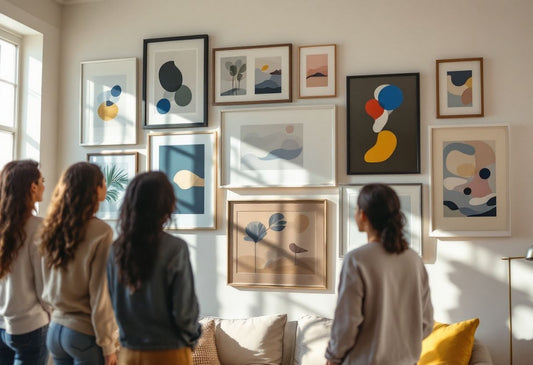
What is Matting in Frames?
Matting refers to the process of placing a border—typically made from cardstock, foam board, or another material—around the artwork inside a frame. The mat serves as a separator between the artwork and the glass or acrylic cover of the frame, adding a layer of depth and creating visual breathing room around the piece.
Key Benefits of Matting:
-
Enhances the Artwork: Matting can elevate artwork by adding contrast and space around the edges, emphasizing the artwork itself.
-
Protection: The mat serves as a protective layer, preventing the artwork from directly touching the frame’s glass or acrylic, which helps to avoid damage from moisture or pressure.
-
Visual Depth: The additional layers involved in matting create depth, making the framed piece feel multidimensional.

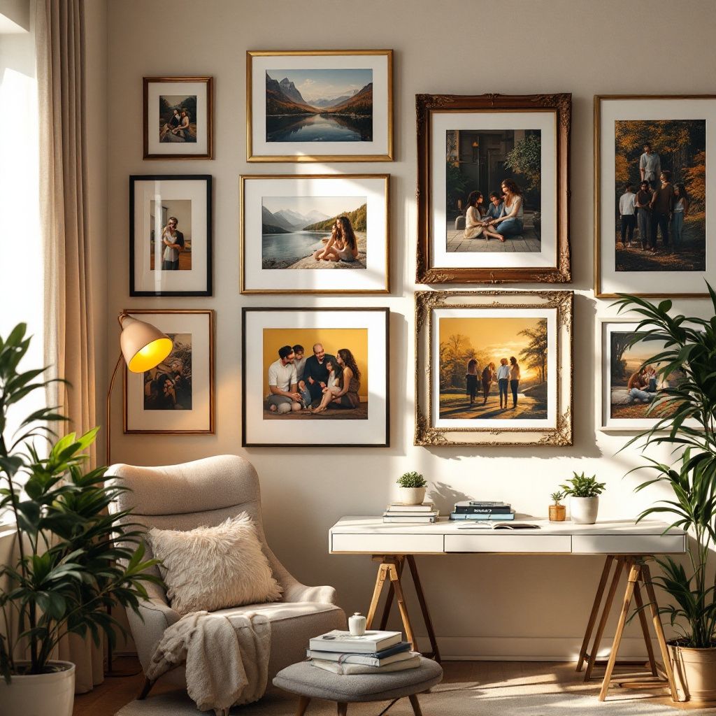
How Adding Layers Improves the Presentation
When it comes to creating a complete framed artwork, adding layers of matting is one of the most versatile strategies. At its core, stacking mats—meaning using two or more mats in a single frame—enhances depth and plays with visual hierarchy. The technique draws the viewer's eye into the center, guiding attention to the artwork itself.
What's the Impact of Adding More Layers?
-
Depth: Each added layer between the artwork and frame increases visual depth. It creates a tiered effect that subtly pushes the piece forward, emphasizing its unique elements. The space created by multiple mats gives the impression that the artwork is almost "floating" inside the frame.
-
Color: Layering and alternating mat colors offer another dimension of customization. A thin inner border of color can offset or echo tones in the photo or artwork itself, adding refinement. Multiple colors provide a sophisticated contrast when done well while still allowing the artwork to remain the focal point.
-
Texture: Matting also opens up opportunities to play with texture. You may have a smooth outer mat and opt for a fabric-like or textured inner mat, which adds a tactile richness. This attention to detail can create cohesion between the mat, frame, and artwork, making the entire presentation more harmonious and engaging.
At Text To Frame It, while we don't offer matting services yet, we focus on optimizing your framed photo's presentation regardless. Just text us your photo, and you'll be able to preview a custom webpage to make your purchase with ease—leaving out all the complexities of layering mats.
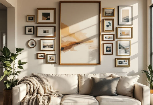
How to Choose the Right Mat
Choosing the right mat depends on many factors, including the artwork's colors, style, and personal preference. While pairing a mat with a frame might seem straightforward, subtle choices can make a major difference in the outcome. Here’s a streamlined breakdown of what to keep in mind:
Match the Mat to the Art
-
Complementary Colors: The goal is harmony, not competition. Use the color wheel as a guide to choose a mat color that complements the artwork. For example, warmer tones such as reds and oranges pair well with cooler tones like blues and greens.
-
Neutral for Classics: Stumped? Neutral tones like white, cream, or gray will showcase most forms of art and avoid clashing with prominent hues. These tones are especially great for black-and-white photography.
-
Bright for Modern Pieces: Matting in frames for more modern or abstract designs can benefit from brighter, non-neutral mats. Vibrant works can be accentuated by equally bold mat choices.
- Multiple Mats for Depth: We’ve already covered how adding layers with multiple mats deepens the visual impact. Try pairing a subtle outer mat with a slightly tinted inner mat to add dimension without drawing focus away from the artwork.
Consider the Frame Material and Style
Don't overlook the frame. The mat should complement and not conflict with it:
-
If the frame is ornate or vintage (e.g., a gold frame), opt for a classical mat style: textured, neutral, or soft-toned to maintain the traditional look.
-
For sleek, minimalist frames—popular in modern art—a simple, streamlined mat helps maintain that crisp, clean look.
Common Mistakes When Choosing a Mat
Even though matting adds a lot to the appearance, there are some common pitfalls to watch out for:
-
Choosing a mat that's too colorful: The mat should amplify the artwork, not overshadow it. Sometimes people pick mats that are too vibrant or too dark, which ends up distracting from the central piece.
-
Improper sizing: The width and balance of the mat in relation to the artwork and the frame are important. A mat that's too wide or too narrow can throw off the visual harmony.
-
Not considering preservation: If the artwork is valuable or a family heirloom, don't forget to use acid-free mats. Many cheap mats contain chemicals that could damage your art over time.
Conclusion
Matting can take a memorable photo or piece of art from functional to fabulous, especially when approached thoughtfully. Whether you’re drawn to the adding layers aspect or simply looking to bring out the best in your artwork without overwhelming it, matting offers strategic and aesthetic advantages that shouldn’t be overlooked.
At Text To Frame It, we understand the importance of matting in frames, which is why framing your photographs with us is so effortless. Just send your image over, and we’ll take care of the rest. If you're curious about how framing works, check out more details here.